Data Visualization with Matplotlib and Seaborn
Data Visualization with Matplotlib and Seaborn
This notebook showcases various data visualization techniques using matplotlib and seaborn. We’ll explore different plot types and best practices for creating effective visualizations.
Topics Covered
- Line plots and time series
- Scatter plots and correlations
- Heatmaps and correlation matrices
- Distribution plots
- 3D visualizations
1. Setup and Data Generation
First, let’s import the necessary libraries and generate some sample data for our visualizations.
import numpy as np
import pandas as pd
import matplotlib.pyplot as plt
import seaborn as sns
from mpl_toolkits.mplot3d import Axes3D
from matplotlib.colors import LinearSegmentedColormap

# Set up plotting style
plt.style.use('seaborn-v0_8')
sns.set_palette("husl")

# Set random seed for reproducibility
np.random.seed(42)

# Generate sample datasets
n_points = 200

# Time series data
time = np.linspace(0, 10, n_points)
trend = 0.5 * time
seasonal = 2 * np.sin(2 * np.pi * time)
noise = np.random.normal(0, 0.5, n_points)
time_series = trend + seasonal + noise

# 2D data for scatter plots
x1 = np.random.multivariate_normal([2, 3], [[1, 0.5], [0.5, 1]], 100)
x2 = np.random.multivariate_normal([6, 7], [[2, -0.8], [-0.8, 2]], 100)
x3 = np.random.multivariate_normal([4, 8], [[1.5, 0.3], [0.3, 1.5]], 100)

# Combine data
scatter_data = np.vstack([x1, x2, x3])
labels = ['Cluster A'] * 100 + ['Cluster B'] * 100 + ['Cluster C'] * 100

# Create correlation matrix data
variables = ['Variable_' + chr(65+i) for i in range(6)]
correlation_matrix = np.array([
    [1.00, 0.73, 0.45, 0.12, -0.23, 0.34],
    [0.73, 1.00, 0.61, 0.28, -0.15, 0.42],
    [0.45, 0.61, 1.00, 0.67, 0.31, 0.58],
    [0.12, 0.28, 0.67, 1.00, 0.73, 0.81],
    [-0.23, -0.15, 0.31, 0.73, 1.00, 0.65],
    [0.34, 0.42, 0.58, 0.81, 0.65, 1.00]
])

print("Data generation complete!")
print(f"Time series: {len(time_series)} points")
print(f"Scatter data: {scatter_data.shape} shape")
print(f"Correlation matrix: {correlation_matrix.shape} shape")
Data generation complete!
Time series: 200 points
Scatter data: (300, 2) shape
Correlation matrix: (6, 6) shape2. Line Plots and Time Series
Line plots are perfect for showing trends over time. Let’s visualize our time series data with different components.
fig, axes = plt.subplots(2, 2, figsize=(15, 10))

# 1. Original time series
axes[0, 0].plot(time, time_series, 'b-', linewidth=1.5, alpha=0.8)
axes[0, 0].set_title('Original Time Series', fontsize=14, fontweight='bold')
axes[0, 0].set_xlabel('Time', fontsize=12)
axes[0, 0].set_ylabel('Value', fontsize=12)
axes[0, 0].grid(True, alpha=0.3)

# 2. Decomposed components
axes[0, 1].plot(time, trend, 'r-', linewidth=2, label='Trend')
axes[0, 1].plot(time, seasonal, 'g-', linewidth=2, label='Seasonal')
axes[0, 1].plot(time, noise, 'b-', linewidth=0.5, alpha=0.5, label='Noise')
axes[0, 1].set_title('Time Series Components', fontsize=14, fontweight='bold')
axes[0, 1].set_xlabel('Time', fontsize=12)
axes[0, 1].set_ylabel('Value', fontsize=12)
axes[0, 1].legend()
axes[0, 1].grid(True, alpha=0.3)

# 3. Moving average
window_size = 20
moving_avg = pd.Series(time_series).rolling(window=window_size).mean()
axes[1, 0].plot(time, time_series, 'b-', linewidth=1, alpha=0.3, label='Original')
axes[1, 0].plot(time, moving_avg, 'r-', linewidth=2, label=f'Moving Avg ({window_size} points)')
axes[1, 0].set_title('Time Series with Moving Average', fontsize=14, fontweight='bold')
axes[1, 0].set_xlabel('Time', fontsize=12)
axes[1, 0].set_ylabel('Value', fontsize=12)
axes[1, 0].legend()
axes[1, 0].grid(True, alpha=0.3)

# 4. Seasonal decomposition visualization
detrended = time_series - trend
axes[1, 1].plot(time, detrended, 'g-', linewidth=1.5, alpha=0.8)
axes[1, 1].axhline(y=0, color='red', linestyle='--', alpha=0.7)
axes[1, 1].set_title('Detrended Time Series', fontsize=14, fontweight='bold')
axes[1, 1].set_xlabel('Time', fontsize=12)
axes[1, 1].set_ylabel('Value', fontsize=12)
axes[1, 1].grid(True, alpha=0.3)

plt.tight_layout()
plt.show()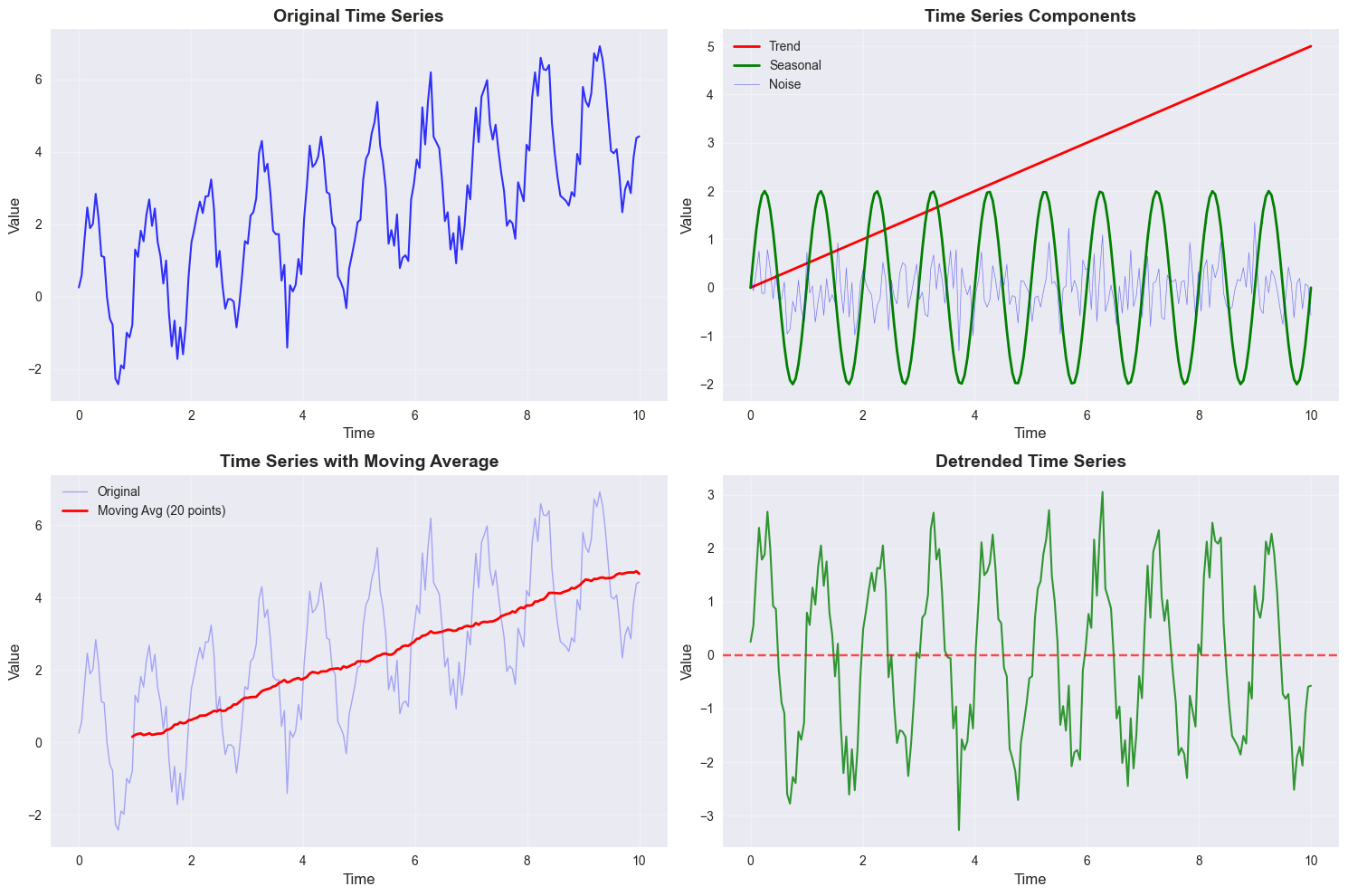
3. Scatter Plots and Correlations
Scatter plots are excellent for showing relationships between two variables. Let’s explore different ways to create informative scatter plots.
# Create DataFrame for easier plotting
df = pd.DataFrame(scatter_data, columns=['X', 'Y'])
df['Cluster'] = labels

fig, axes = plt.subplots(2, 2, figsize=(15, 12))

# 1. Basic scatter plot
axes[0, 0].scatter(scatter_data[:, 0], scatter_data[:, 1], alpha=0.6, s=50)
axes[0, 0].set_title('Basic Scatter Plot', fontsize=14, fontweight='bold')
axes[0, 0].set_xlabel('X Variable', fontsize=12)
axes[0, 0].set_ylabel('Y Variable', fontsize=12)
axes[0, 0].grid(True, alpha=0.3)

# 2. Colored by cluster
colors = ['red', 'blue', 'green']
for i, cluster in enumerate(['Cluster A', 'Cluster B', 'Cluster C']):
    cluster_data = df[df['Cluster'] == cluster]
    axes[0, 1].scatter(cluster_data['X'], cluster_data['Y'],
                      c=colors[i], label=cluster, alpha=0.7, s=50)
axes[0, 1].set_title('Scatter Plot by Cluster', fontsize=14, fontweight='bold')
axes[0, 1].set_xlabel('X Variable', fontsize=12)
axes[0, 1].set_ylabel('Y Variable', fontsize=12)
axes[0, 1].legend()
axes[0, 1].grid(True, alpha=0.3)

# 3. With regression line
sns.regplot(data=df, x='X', y='Y', scatter_kws={'alpha':0.6},
            line_kws={'color': 'red', 'linewidth': 2}, ax=axes[1, 0])
axes[1, 0].set_title('Scatter Plot with Regression Line', fontsize=14, fontweight='bold')
axes[1, 0].set_xlabel('X Variable', fontsize=12)
axes[1, 0].set_ylabel('Y Variable', fontsize=12)
axes[1, 0].grid(True, alpha=0.3)

# 4. Density plot
sns.kdeplot(data=df, x='X', y='Y', fill=True, alpha=0.6, ax=axes[1, 1])
axes[1, 1].set_title('Density Plot', fontsize=14, fontweight='bold')
axes[1, 1].set_xlabel('X Variable', fontsize=12)
axes[1, 1].set_ylabel('Y Variable', fontsize=12)
axes[1, 1].grid(True, alpha=0.3)

plt.tight_layout()
plt.show()

# Calculate and display correlation
correlation = np.corrcoef(scatter_data[:, 0], scatter_data[:, 1])[0, 1]
print(f"Correlation coefficient: {correlation:.3f}")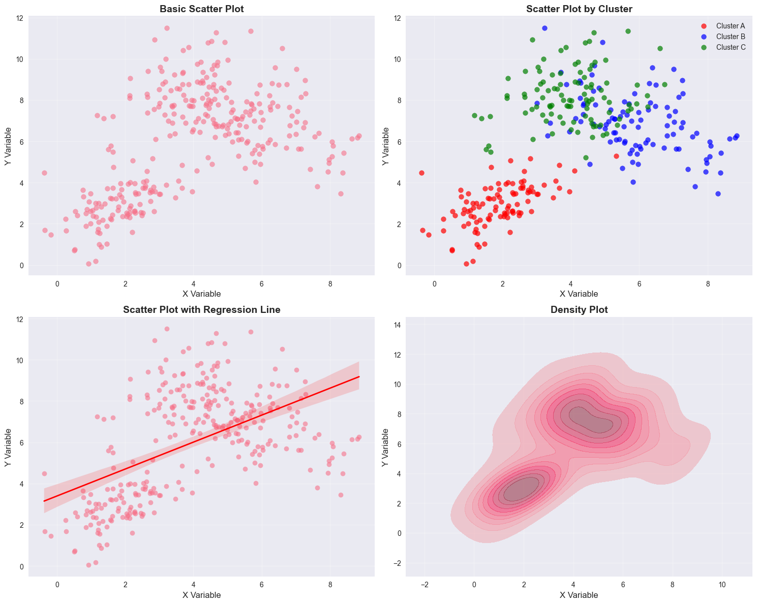
Correlation coefficient: 0.5204. Heatmaps and Correlation Matrices
Heatmaps are perfect for visualizing correlation matrices and other 2D data structures.
fig, axes = plt.subplots(2, 2, figsize=(16, 12))

# 1. Basic correlation heatmap
sns.heatmap(correlation_matrix, annot=True, cmap='coolwarm', center=0,
            square=True, ax=axes[0, 0], cbar_kws={'label': 'Correlation'})
axes[0, 0].set_title('Correlation Matrix', fontsize=14, fontweight='bold')
axes[0, 0].set_xticklabels(variables, rotation=45)
axes[0, 0].set_yticklabels(variables)

# 2. Custom colormap heatmap
custom_cmap = LinearSegmentedColormap.from_list('custom',
                                                 ['darkblue', 'white', 'darkred'])
sns.heatmap(correlation_matrix, annot=True, cmap=custom_cmap, center=0,
            square=True, ax=axes[0, 1], cbar_kws={'label': 'Correlation'})
axes[0, 1].set_title('Custom Colormap Heatmap', fontsize=14, fontweight='bold')
axes[0, 1].set_xticklabels(variables, rotation=45)
axes[0, 1].set_yticklabels(variables)

# 3. Clustered heatmap
sns.clustermap(correlation_matrix, annot=True, cmap='coolwarm', center=0,
               figsize=(8, 8), row_cluster=True, col_cluster=True)
axes[1, 0].axis('off')  # Hide this subplot as clustermap creates its own figure
axes[1, 0].text(0.5, 0.5, 'Clustermap shown separately',
                 ha='center', va='center', transform=axes[1, 0].transAxes)

# 4. Masked heatmap (showing only strong correlations)
mask = np.abs(correlation_matrix) < 0.5
sns.heatmap(correlation_matrix, annot=True, cmap='coolwarm', center=0,
            square=True, ax=axes[1, 1], mask=mask,
            cbar_kws={'label': 'Correlation'})
axes[1, 1].set_title('Strong Correlations Only (|r| > 0.5)', fontsize=14, fontweight='bold')
axes[1, 1].set_xticklabels(variables, rotation=45)
axes[1, 1].set_yticklabels(variables)

plt.tight_layout()
plt.show()

# Show the clustered heatmap separately
plt.figure(figsize=(8, 6))
clustermap = sns.clustermap(correlation_matrix, annot=True, cmap='coolwarm', center=0)
clustermap.ax_heatmap.set_title('Clustered Correlation Matrix', fontsize=14, fontweight='bold')
plt.show()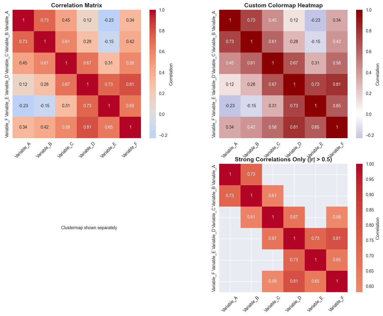
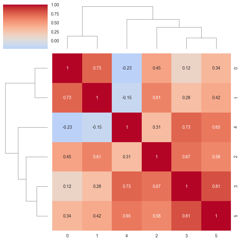
<Figure size 800x600 with 0 Axes>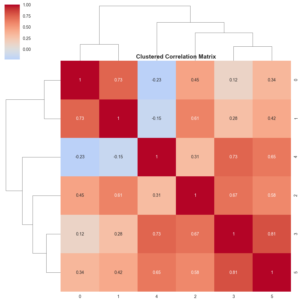
5. Distribution Plots
Understanding the distribution of your data is crucial for statistical analysis and modeling.
# Generate different distributions
np.random.seed(42)
n_samples = 1000

# Different distributions
normal_data = np.random.normal(0, 1, n_samples)
uniform_data = np.random.uniform(-2, 2, n_samples)
exponential_data = np.random.exponential(1, n_samples)
bimodal_data = np.concatenate([np.random.normal(-2, 0.5, n_samples//2),
                               np.random.normal(2, 0.5, n_samples//2)])

fig, axes = plt.subplots(2, 3, figsize=(18, 12))

# 1. Histogram with KDE
sns.histplot(normal_data, kde=True, bins=30, ax=axes[0, 0])
axes[0, 0].set_title('Normal Distribution', fontsize=14, fontweight='bold')
axes[0, 0].set_xlabel('Value', fontsize=12)
axes[0, 0].set_ylabel('Frequency', fontsize=12)

# 2. Box plot comparison
data_for_box = [normal_data, uniform_data, exponential_data, bimodal_data]
labels = ['Normal', 'Uniform', 'Exponential', 'Bimodal']
axes[0, 1].boxplot(data_for_box, labels=labels)
axes[0, 1].set_title('Box Plot Comparison', fontsize=14, fontweight='bold')
axes[0, 1].set_ylabel('Value', fontsize=12)
axes[0, 1].grid(True, alpha=0.3)

# 3. Violin plot
violin_data = pd.DataFrame({
    'Value': np.concatenate(data_for_box),
    'Distribution': np.repeat(labels, n_samples)
})
sns.violinplot(data=violin_data, x='Distribution', y='Value', ax=axes[0, 2])
axes[0, 2].set_title('Violin Plot Comparison', fontsize=14, fontweight='bold')
axes[0, 2].set_ylabel('Value', fontsize=12)

# 4. Q-Q plot for normality check
from scipy import stats
stats.probplot(normal_data, dist="norm", plot=axes[1, 0])
axes[1, 0].set_title('Q-Q Plot (Normal Data)', fontsize=14, fontweight='bold')
axes[1, 0].grid(True, alpha=0.3)

# 5. Cumulative distribution
sorted_normal = np.sort(normal_data)
cumulative = np.arange(1, len(sorted_normal) + 1) / len(sorted_normal)
axes[1, 1].plot(sorted_normal, cumulative, 'b-', linewidth=2)
axes[1, 1].set_title('Cumulative Distribution', fontsize=14, fontweight='bold')
axes[1, 1].set_xlabel('Value', fontsize=12)
axes[1, 1].set_ylabel('Cumulative Probability', fontsize=12)
axes[1, 1].grid(True, alpha=0.3)

# 6. Multiple distributions overlay
sns.kdeplot(normal_data, label='Normal', fill=True, alpha=0.3)
sns.kdeplot(uniform_data, label='Uniform', fill=True, alpha=0.3)
sns.kdeplot(exponential_data, label='Exponential', fill=True, alpha=0.3)
sns.kdeplot(bimodal_data, label='Bimodal', fill=True, alpha=0.3)
axes[1, 2].set_title('Distribution Comparison', fontsize=14, fontweight='bold')
axes[1, 2].set_xlabel('Value', fontsize=12)
axes[1, 2].set_ylabel('Density', fontsize=12)
axes[1, 2].legend()
axes[1, 2].grid(True, alpha=0.3)

plt.tight_layout()
plt.show()

# Print summary statistics
print("Summary Statistics:")
print(f"Normal: μ={np.mean(normal_data):.3f}, σ={np.std(normal_data):.3f}")
print(f"Uniform: μ={np.mean(uniform_data):.3f}, σ={np.std(uniform_data):.3f}")
print(f"Exponential: μ={np.mean(exponential_data):.3f}, σ={np.std(exponential_data):.3f}")
print(f"Bimodal: μ={np.mean(bimodal_data):.3f}, σ={np.std(bimodal_data):.3f}")
/tmp/ipykernel_2801800/1688390273.py:23: MatplotlibDeprecationWarning: The 'labels' parameter of boxplot() has been renamed 'tick_labels' since Matplotlib 3.9; support for the old name will be dropped in 3.11.
axes[0, 1].boxplot(data_for_box, labels=labels)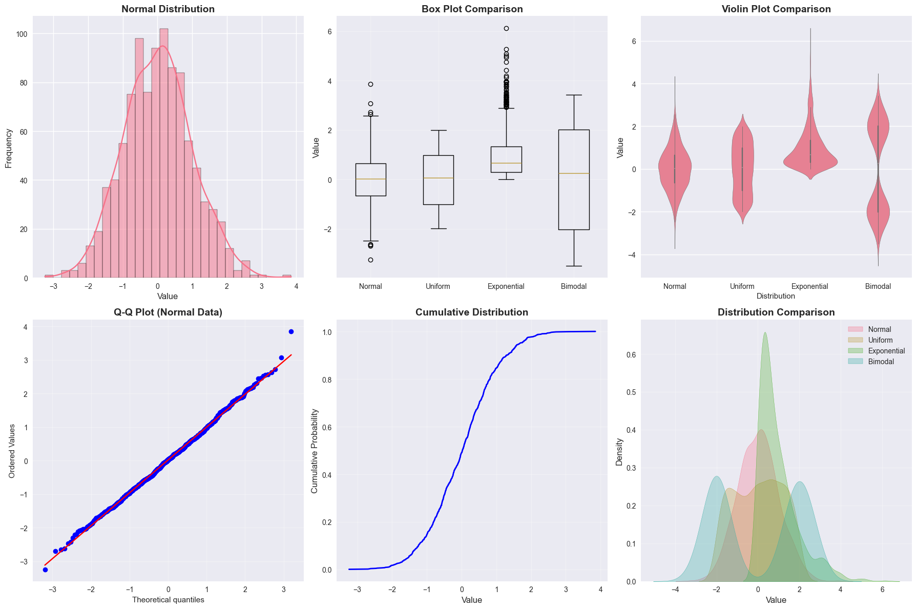
Summary Statistics:
Normal: μ=0.019, σ=0.979
Uniform: μ=0.015, σ=1.153
Exponential: μ=0.973, σ=0.945
Bimodal: μ=0.004, σ=2.073
6. 3D Visualizations
Three-dimensional plots can help visualize complex relationships in three variables.
# Generate 3D data
x = np.linspace(-5, 5, 50)
y = np.linspace(-5, 5, 50)
X, Y = np.meshgrid(x, y)

# Create different 3D surfaces
Z1 = np.sin(np.sqrt(X**2 + Y**2))  # Ripple pattern
Z2 = X**2 + Y**2  # Paraboloid
Z3 = np.exp(-(X**2 + Y**2)/10) * np.cos(X) * np.sin(Y)  # Complex surface

fig = plt.figure(figsize=(18, 12))

# 1. Surface plot
ax1 = fig.add_subplot(2, 3, 1, projection='3d')
surf1 = ax1.plot_surface(X, Y, Z1, cmap='viridis', alpha=0.8)
ax1.set_title('Surface Plot: Ripple Pattern', fontsize=12, fontweight='bold')
ax1.set_xlabel('X')
ax1.set_ylabel('Y')
ax1.set_zlabel('Z')
fig.colorbar(surf1, ax=ax1, shrink=0.5)

# 2. Wireframe plot
ax2 = fig.add_subplot(2, 3, 2, projection='3d')
wire2 = ax2.plot_wireframe(X, Y, Z2, color='blue', alpha=0.6, linewidth=0.5)
ax2.set_title('Wireframe Plot: Paraboloid', fontsize=12, fontweight='bold')
ax2.set_xlabel('X')
ax2.set_ylabel('Y')
ax2.set_zlabel('Z')

# 3. Contour plot
ax3 = fig.add_subplot(2, 3, 3)
contour = ax3.contour(X, Y, Z3, levels=20, cmap='coolwarm')
ax3.clabel(contour, inline=True, fontsize=8)
ax3.set_title('Contour Plot: Complex Surface', fontsize=12, fontweight='bold')
ax3.set_xlabel('X')
ax3.set_ylabel('Y')
fig.colorbar(contour, ax=ax3)

# 4. Filled contour plot
ax4 = fig.add_subplot(2, 3, 4)
contourf = ax4.contourf(X, Y, Z1, levels=20, cmap='viridis')
ax4.set_title('Filled Contour Plot', fontsize=12, fontweight='bold')
ax4.set_xlabel('X')
ax4.set_ylabel('Y')
fig.colorbar(contourf, ax=ax4)

# 5. 3D scatter plot
ax5 = fig.add_subplot(2, 3, 5, projection='3d')
# Generate random 3D points
np.random.seed(42)
n_points_3d = 200
x_3d = np.random.normal(0, 2, n_points_3d)
y_3d = np.random.normal(0, 2, n_points_3d)
z_3d = np.random.normal(0, 2, n_points_3d)
colors_3d = np.sqrt(x_3d**2 + y_3d**2 + z_3d**2)

scatter_3d = ax5.scatter(x_3d, y_3d, z_3d, c=colors_3d, cmap='plasma', alpha=0.6)
ax5.set_title('3D Scatter Plot', fontsize=12, fontweight='bold')
ax5.set_xlabel('X')
ax5.set_ylabel('Y')
ax5.set_zlabel('Z')
fig.colorbar(scatter_3d, ax=ax5, shrink=0.5)

# 6. 2D projection of 3D data
ax6 = fig.add_subplot(2, 3, 6)
scatter_2d = ax6.scatter(x_3d, y_3d, c=z_3d, cmap='plasma', alpha=0.6)
ax6.set_title('2D Projection (Color = Z)', fontsize=12, fontweight='bold')
ax6.set_xlabel('X')
ax6.set_ylabel('Y')
fig.colorbar(scatter_2d, ax=ax6)

plt.tight_layout()
plt.show()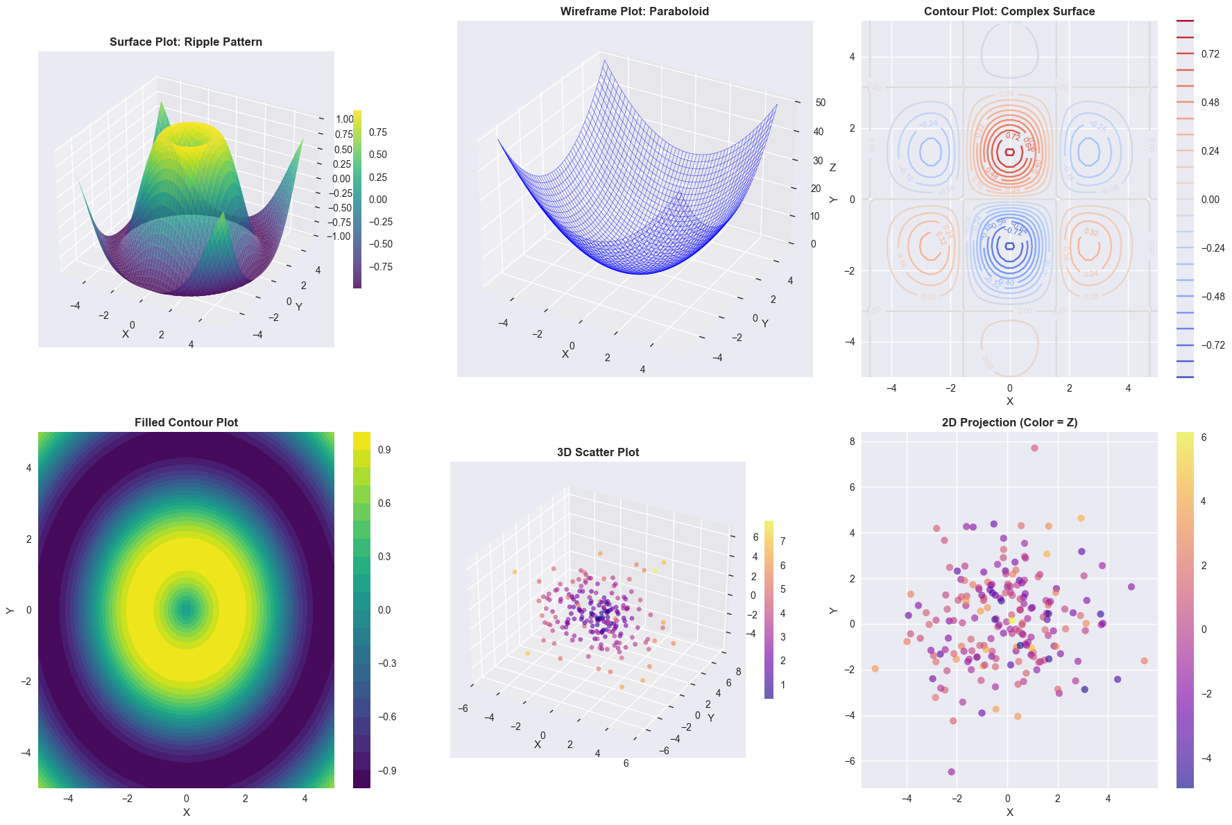
7. Advanced Plotting Techniques
Let’s explore some advanced techniques for creating publication-quality plots.
# Create a complex multi-panel figure
fig = plt.figure(figsize=(16, 10))
gs = fig.add_gridspec(3, 3, hspace=0.3, wspace=0.3)

# Main plot (larger)
ax_main = fig.add_subplot(gs[:2, :2])
ax_main.scatter(scatter_data[:, 0], scatter_data[:, 1],
               c=range(len(scatter_data)), cmap='viridis',
               s=50, alpha=0.7)
ax_main.set_title('Main Scatter Plot with Color Gradient', fontsize=14, fontweight='bold')
ax_main.set_xlabel('X Variable', fontsize=12)
ax_main.set_ylabel('Y Variable', fontsize=12)
ax_main.grid(True, alpha=0.3)

# Histogram on top
ax_top = fig.add_subplot(gs[0, 2])
ax_top.hist(scatter_data[:, 0], bins=20, alpha=0.7, color='skyblue', edgecolor='black')
ax_top.set_title('X Distribution', fontsize=10)
ax_top.set_ylabel('Frequency', fontsize=10)
ax_top.grid(True, alpha=0.3)

# Histogram on right
ax_right = fig.add_subplot(gs[1, 2])
ax_right.hist(scatter_data[:, 1], bins=20, alpha=0.7, color='lightcoral',
              edgecolor='black', orientation='horizontal')
ax_right.set_title('Y Distribution', fontsize=10)
ax_right.set_xlabel('Frequency', fontsize=10)
ax_right.grid(True, alpha=0.3)

# Box plots at bottom
ax_box = fig.add_subplot(gs[2, :])
box_data = [scatter_data[:, 0], scatter_data[:, 1]]
box_plot = ax_box.boxplot(box_data, labels=['X Variable', 'Y Variable'],
                          patch_artist=True)
colors = ['skyblue', 'lightcoral']
for patch, color in zip(box_plot['boxes'], colors):
    patch.set_facecolor(color)
    patch.set_alpha(0.7)
ax_box.set_title('Distribution Comparison', fontsize=12, fontweight='bold')
ax_box.set_ylabel('Value', fontsize=12)
ax_box.grid(True, alpha=0.3)

plt.suptitle('Comprehensive Data Visualization Dashboard',
             fontsize=16, fontweight='bold', y=0.98)
plt.show()
/tmp/ipykernel_2801800/1451512682.py:33: MatplotlibDeprecationWarning: The 'labels' parameter of boxplot() has been renamed 'tick_labels' since Matplotlib 3.9; support for the old name will be dropped in 3.11.
box_plot = ax_box.boxplot(box_data, labels=['X Variable', 'Y Variable'],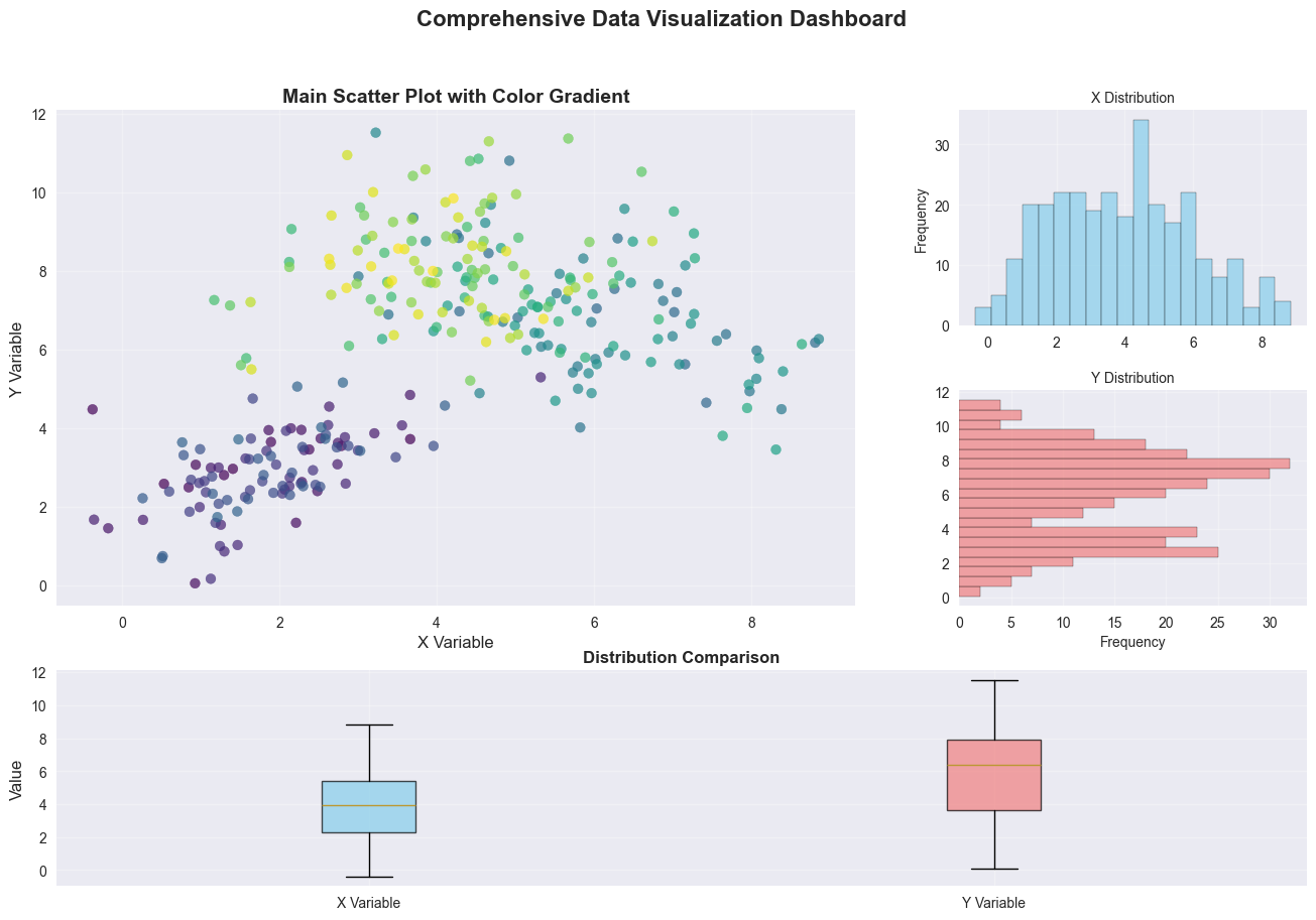
Summary
This notebook demonstrated various data visualization techniques:
- Time Series Analysis: Line plots, moving averages, and decomposition
- Scatter Plots: Basic, colored, regression, and density plots
- Heatmaps: Correlation matrices with different styling options
- Distribution Analysis: Histograms, box plots, violin plots, Q-Q plots
- 3D Visualizations: Surface plots, wireframes, and scatter plots
- Advanced Techniques: Multi-panel figures and publication-quality plots
Each visualization type serves different purposes:
- Line plots for trends over time
- Scatter plots for relationships between variables
- Heatmaps for correlation matrices and 2D data
- Distribution plots for understanding data characteristics
- 3D plots for complex multi-dimensional relationships
Key takeaways for effective data visualization:
- Choose the right plot type for your data and question
- Use appropriate colors and styling
- Include clear labels and legends
- Consider the audience and purpose of the visualization